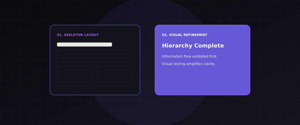
Every project starts with a blank canvas and the temptation to make it beautiful immediately.
The first thing designers reach for is color. Then typography choices. Then micro-animations. And often, weeks in, we realize the underlying structure doesn't work - the information hierarchy is broken, the navigation is confusing, the content has no clear priority.
Structure is the skeleton. Visual design is the skin. You can't build a good skin on a broken skeleton.
What structure means
Structure means: what information exists, what order does it appear in, and what relationships does it have with other information.
Before you pick a typeface, you need to know:
- ◆What is the primary message?
- ◆What does the user need to do first?
- ◆What do they need to understand before they can act?
These are structural questions. They're answered with outlines, hierarchies, and content maps - not Figma.
The hierarchy test
Take any screen you're designing and remove all color, images, and decorative elements. What's left?
If what remains is clear - if a stranger could understand the priority and flow of the page from just the text and layout - you have good structure.
If it's confusing in black and white, adding color won't fix it. You'll just have a colorful mess.
How information flows
The structural principle applied to information design:
[Diagram Representation]
flowchart TD
    A[Primary Message] --> B[User Action Goal]
    B --> C[Supporting Context]
    C --> D[Secondary Details]
    D --> E[Visual Decoration]
    style A fill:#6558d4,color:#fff
    style E fill:#e5e5e5,color:#333
Structure is a form of respect
Users come to your product with a specific need. Structure is how you honor that need - by making the path clear, the priority obvious, and the experience efficient.
Visual design is how you make that structure feel welcome. But structure comes first.